Uniting a Company Under One Brand.
Total Safety Consulting needed to visually unify their 6 divisions to strengthen their brand identity. Over the years, the brand lost consistency in color, font and design. The websites had different designers working on them and over time, muddled the brand.
We tackled the logo and website redesign first, so it now represents the company and has become a recognizable family.
Raising the Bar
Next, we redesigned the parent company website to position them as high-level strategists, not just vendors. We chose big, colorful images of their major projects and rewrote much of the copy. before, it was generic and gave no sense of what it’s like to work with them.
This main website has individual pages for each of their main divisions which link to their own websites. Network9 created the whole family of websites.
Now, there is one main web destination for TSC, where people get a sense of the size, work ethic and talents of the company.
 Total Safety Consulting Home page. Big image of a major project, bold, bright colors and font.
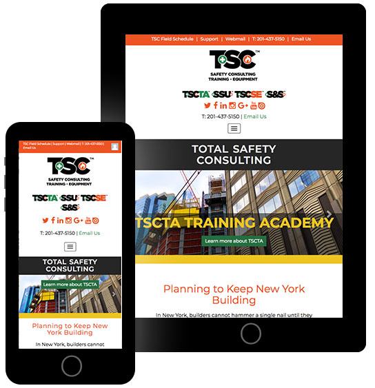 TSC Home Page view with slider images, each one linking to individual pages for each of their divisions.
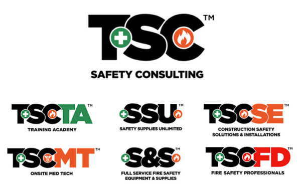 For the parent company, TSC, we set the standard for them and for its child companies. Now, they are united in style, color and design, making them a family identity.
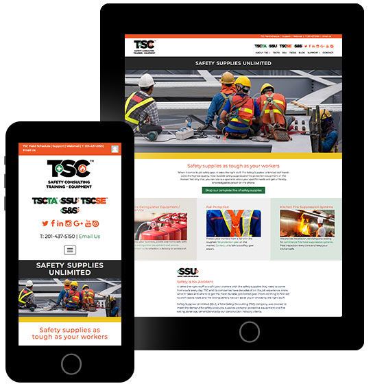 Individual company pages were created to showcase each separate division within the TSC enterprise. Each one links to its own website, also designed by Network9.
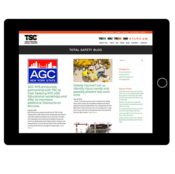 Blog Page Tablet View
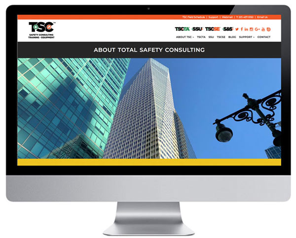 Total Safety Consulting Company page on desktop
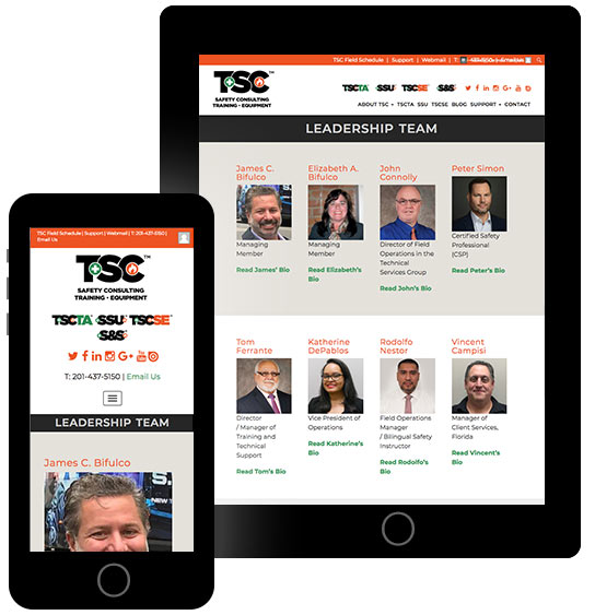 The Leadership team page designed on a grid layout. Each image links to the bio page.
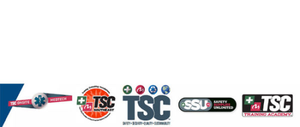 Here is a set of the old logos. We retained the block letters, while unifying the colors, fonts and removing the effects to give a cleaner look.
