
Responsive Website Design

Responsive Website Design is not optional
Every website we design and build is responsive and has been for the last several years. The trend to mobile use is nothing new, but in 2015, it surpassed desktop use. Then it became an SEO issue as well, as Google now rewards websites that are mobile friendly. For businesses, responsive website design is no longer an option. Users will click off any website that is not easy to use. Read more about why you should have a mobile friendly website

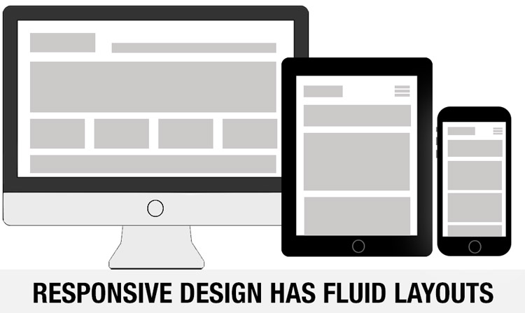
What is Responsive Design?
When a website “responds” to the device it is viewed on, the fluid layout shifts from a horizontal set of elements (desktop) to a vertical stack (phone/tablet). Menus collapse from a line of text to a “Hamburger” menu. Images and text change size as well. Phones and tablets are narrower, and you can’t just make your website smaller. No human can read it, and people aren’t pleased to stretch their screens and scroll back and forth to try and read content. Responsive website design gives the user a customized experience no matter what device they are on.
Responsive Vs. Adaptive
Adaptive websites are different than responsive. Adaptive design “detects and identifies the user’s device and then generates a page matched to the device capabilities.” In other words, pages are built specifically for each device and served up as needed. Elements may be eliminated for mobile to simplify the experience. It is a much larger investment for a company to design and develop a website this way. Responsive design is a single development with flexible grids that display differently as screen size varies.
How the Responsive Era has Affected Website Design
In the HTML age, we designers could put elements anywhere we wanted, resulting in some pretty amazing website designs. Now, we design for mobile first. That means we work from a vertical layout, which originates as a grid. Sections of the grid can have any number of columns, which stack for mobile and display horizontally on phones and tablets. This gives the desktop version a distinctive look as well. Designs are pared down, simpler, cleaner and leaner. This is a good thing for users.
How it Works
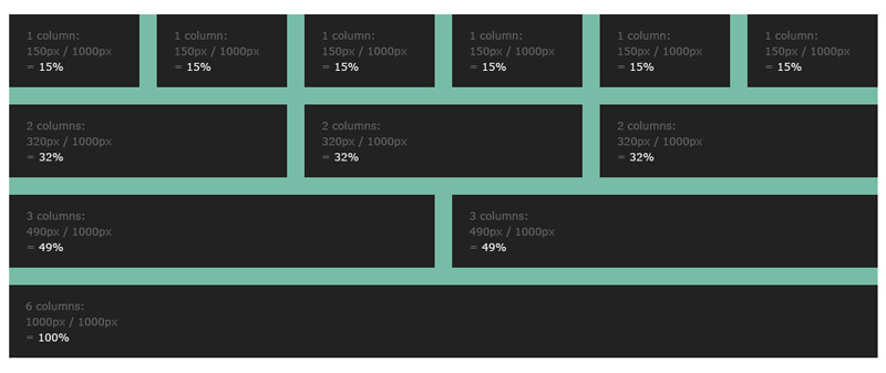
Responsive design is based on grids and percentages. The grid can be any width with as many columns as needed. Since the website elements are %age based, it uses a relative width concept. The days of 800 x 600 fixed widths are over.
You’ll want a grid that divides into the total width evenly, allowing for gutters and margins. Finally, we need the math lessons we missed in High School!
Is your website mobile friendly?
If you are one of the holdouts, wait no more. You may be losing customers because they are going to sites that are easy to view and work on phones. We always have our phones with us, not our desktops. User experience is hugely important on converting visitors to customers. Don’t let those leads go to your competitors. Call us today and go mobile now.