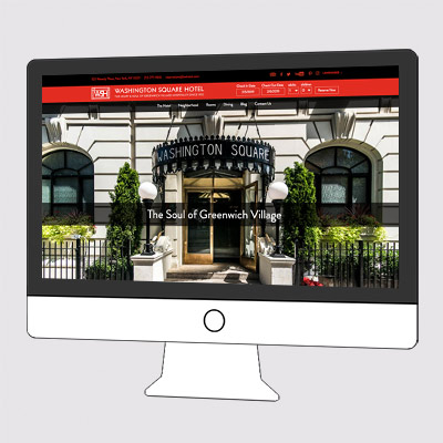
This hotel website redesign was a truly a study in usability design.
When the hotel first came to us, this is what we found:
- The home page was a series of scrolling images with a bit of text on each one, which was annoying to scroll through and had no opportunity for comprehensive information
- You could not view the rooms on the home page, the primary function of the hotel
- The navigation menu was down the side and almost inaccessible
- The blog was hard to find but had great content
- The site was not ADA compliant
What we did in the Redesign
The goal was to make all of the interior page content accessible from the home page, so users could decide what they wanted to explore. We prioritized the content this way:
- Big image of the hotel with a headline
- Immediate hotel happenings
- A section about the hotel
- Rooms
- Dining
- Recent posts
- Testimonials/Press
- Video/Map of what sights are within a mile of the hotel
- Amenities/Special Offers
- Call to action
Now, visitors can scan and click on what they are interested in.
Further, we redesigned the navigation system to be consistent across every page, and always accessible at the top. We added their contact info, language translator and social links to the top of the page.
What’s next:
Now, we will apply this idea to all the pages, so the scrolling function is gone and content is easier to access. It allows more text to be added to describe their history, the rooms and their restaurant. Good for visitors, good for their SEO.
ADA compliance:
The back end of this site needed to function for the visually-impaired. We did the necessary work and brought it into compliance. Read more about ADA Compliance here
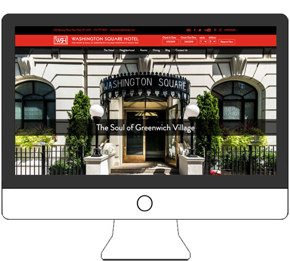 The new Home Page design focuses on usability, with a priority on content that makes this hotel so special.
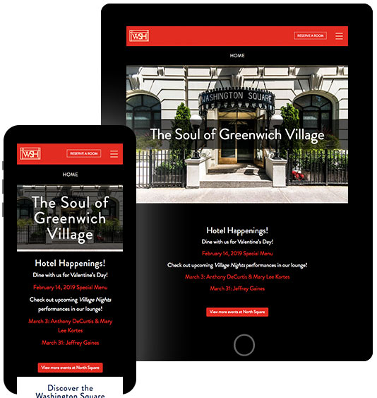 Washington Square-Hotel Website redesign nows works beautifully on phone and tablet.
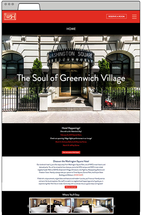 From the top down, this site is much more user-friendly. A big image and headline, current hotel events, introductory text and a slider viewing the rooms start the home page.
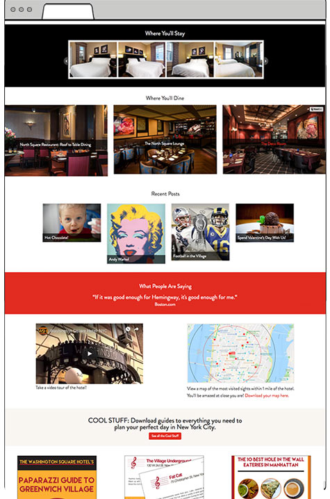 As the user scrolls or swipes down, they see where to dine, featured posts, testimonials, video, map, reasons to stay with them and Special offers, in one easy to navigate page.
