Behind the Scenes: A Rear View of Bruce Springsteen
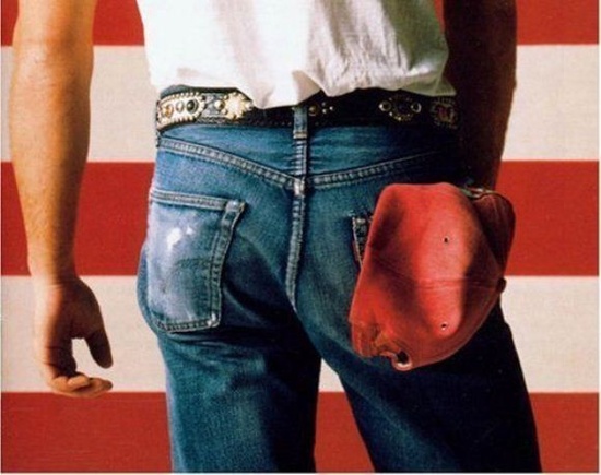
A rear view of Bruce Springsteen was an unusual choice for an album cover
The Boss’ butt. There, we said it. Forget J.Lo or Beyonce — Bruce Springsteen gets our vote for the most iconic ass in rock’n’roll.
We’re not just being cheeky. The Born in the USA album cover, also known as the butt shot scene ’round the world, had something truly special about it. The image — and Bruce’s obvious assets — instantly became a classic. Bruce’s butt stands alongside The Rolling Stone’s tongue or Elvis’ hips, as a body part that became a rock’n’roll icon.

“Most of Springsteen’s biographers and music critics are men,” says Carmen, chief Network9-er and Bruce diehard. “They talk about his intelligence, his writing, his music, and his charisma, which of course, are mind-boggling. But they don’t talk about how gorgeous he really is, front AND back. Annie Liebowitz really got it.”
Ass aside, let’s look at the album design itself
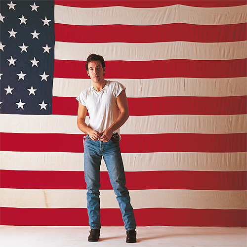
Annie Liebowitz photographed the iconic Born in the USA cover, which was the perfect visual language for Bruce’s music. Below is an outtake from Springsteen’s session shot from the front that didn’t make the cut. It’s a terrific photo and iconic in its own right. So why didn’t it make the cover? In other words, why the butt?

The final image has two elements: Bruce’s body and the flag, repeated here for reference. Both images are fragments of the whole, shown close up. There is no need for stars on the American flag — we fill them in. Bruce’s blue jeans provide the blue in the red, white and blue imagery. The body could be anonymous, but we all know it is Bruce himself. Decked out in the rock’n’roll uniform of blue jeans and a white t-shirt with a confident stance, this is the Bruce that men want to be, and women want to be with. Even without his face, the pose has attitude, confidence and cool.

The hat
The red baseball cap stuffed into his back pocket belonged to his old pal Lance Larson from New Jersey. When Larson’s father died, he gave Bruce his dad’s favorite red baseball cap. Springsteen decided to wear it on the cover of Born in the USA in tribute. He told Larson that his father would always live on in music history. How right he was.
What can we learn about design?
Shooting Bruce from behind “shows a unique point of view,” says Carmen. At the time, the shot caused controversy (what’s rock’n’roll without a little uproar?). Was Springsteen facing the flag in admiration, or was placing his butt in front of it a subversive gesture? Some even suggested he was urinating on the flag. Because in Born in the USA, Bruce points out how America neglects our veterans, and is not the rah rah anthem Ronald Reagan thought it was.
But we think it’s more about creating drama by leaving something out.
We learned a few things form studying this cover, once we got past its obvious qualities.
- Look at things differently.
- Try another point of view.
- Make objects larger, or smaller.
- Focus on something unique and interesting.
- Show emotion.
- Be authentic.
- Leave something to the imagination.
As great album design should, the image reflects the content of his music, Bruce’s attitude, and creates an emotional response, even with all his clothes on and not showing his face. It works because it is authentic, which is a messaging strategy all bosses can learn from The Boss. So be like Bruce. Show off your assets.


