Funky, Modern, Accessible: A Chat with Designer Elliot Kreloff

In our last newsletter the interview Carmen did for the Stevie Awards was such a big hit with our readers, it gave us pause. Maybe readers really want to know more about the human element of Network9. So over the next months, we will reveal our people – the folks behind the design, branding and copy that inspire you and make us tick — Network9′ers…Revealed.
The interview with designer Elliot Kreloff
Designer Elliot Kreloff has been working with us as a designer for the past 3 years, but he and Carmen go back further than that…WAY further. Carmen and Elliot went to high school together, Class of…never mind.
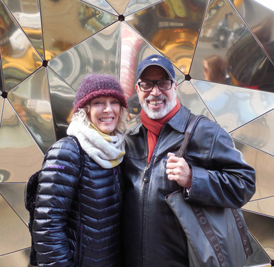
Elliot’s wildly impressive résumé includes work for Blue Apple Books, Scholastic, Macmillan and Disney, with skills ranging from illustration to information design to, our favorite, web design! When he was at Scholastic he designed their first web site and an online curriculum-based subscription service for classroom use. With a passion for visual communication, this experienced branding pro knows how to create eye-catching designs that address both the needs and aspirations of our clients.
What makes Elliot a branding pro? In a phrase borrowed from Elliot, N9’er Brigitte “explores his world.”
Brigitte: You and Carmen electrify a room when you start brainstorming ways of bringing a client’s identity into a visual language, giving them a virtual voice – in other words, a brand. So tell me, what excites you (turns you on) about creating a brand?
Elliot: Whether creating a company-wide brand or designing a book cover, what excites me when I get an assignment is the combination of problem solving and collaboration.
Solving problems comes first
When you are hired as a designer, you have been hired by another person/company (the client) to solve their problem. The client often doesn’t look at their assignment as solving a problem, and therefore might not even know what the problem is. But together—as a collaboration between designer and client—we will define the problem, present solutions to that problem, and together, choose what works best as a solution.
In the case of branding, the goal is to improve the perception of the company, and through that perception, improve business. We, the designers, get to roll up our sleeves and do the research to find out WHO the client is. We need to immerse ourselves in the world of their company, their business. In this new world we ask ourselves: Who are we? How are we unique in our marketplace? Who are our competitors? Clients? Customers? With every job, I get to explore a new world, and learn something new about their world.
It’s like putting on someone else’s clothes, living in their house for a while and learning something about a world that I didn’t know before.
Immersing ourselves in a new culture
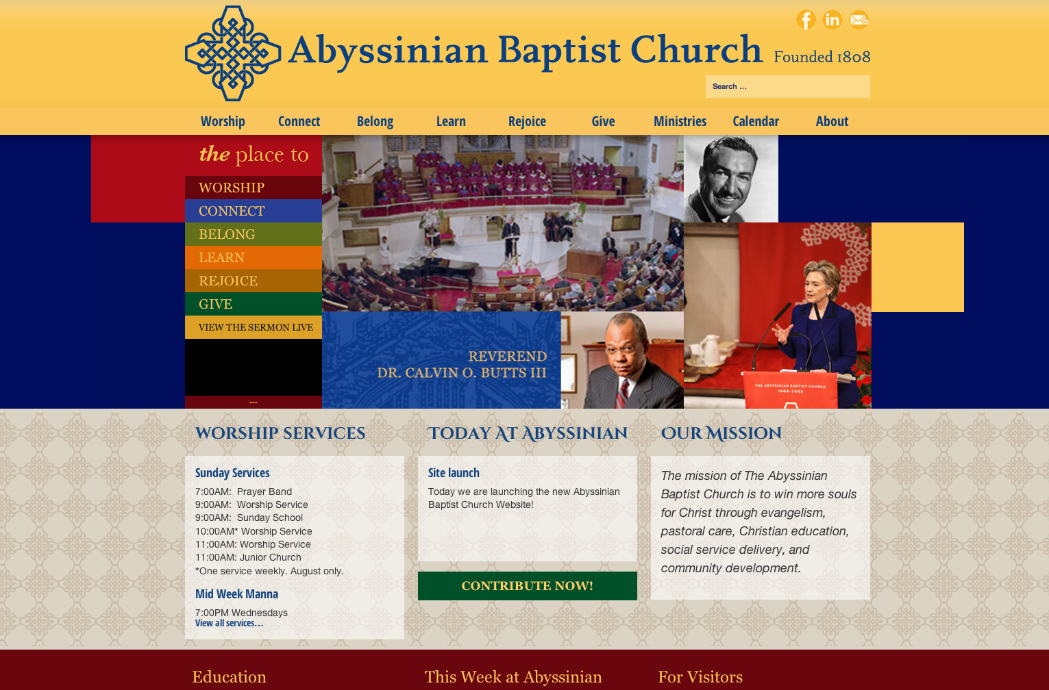
When Carmen and I did research for Abyssinian Baptist Church’s soon-to-be launched website, in addition to visiting the church, we spent time in my home turf, Harlem, exploring, having dinner, taking in the surroundings, the colors, textures, and rhythms of that unique place. We explored the role of religion in that part of the city and how the culture of the neighborhood was reflected in the fabric of the church, and vice versa. It was thrilling to experience a different culture from a new perspective. Once we had done this kind of visceral research, only then could we start to work to translate that experience into a visual language that could be used, not only to inform the the look of the web site, but how the information on that web site would be organized and presented.
Brigitte: What’s the first step in branding? How do you and Carmen begin?
Elliot: We have a client meeting to find out what are they are currently unhappy with, why have they come to us. We look at their competitors. We explore with them who they think they are, who they want to be and how they want to be seen, and also how they don’t want to be seen.
For example, with Telehouse, they had a 4-year-old website that wasn’t in sync with who they are today. They are 1st in their industry and wanted to demonstrate the qualities of dependability, the fact they they are pioneers in the field, and at the same time being on the cutting edge of technology. In other words, how do you say “you can trust us because we have experience” without sending the message “we’re old and out of sync”? Or, on the other hand communicating, “we’re cutting edge,” without sending the message “this technology is so new, it may not really be tested.” Could we come up with branding that was basically communicating two polar opposites at the same time?

After much research and weeks of brainstorming, we landed on THINK NEXT… We realized they didn’t need to worry about their industry standing. After we did the research we understood that their audience got that. Telehouse was well situated in the industry, but they did need to let people in the field know that they had not lost their edge. So we gave them THINK NEXT—a short, memorable, iconic statement that communicated the perpetual ability of always being ahead of the curve.
Brigitte: What can a client do to help you identify their unique voice in their marketplace? What can they give you so that you have the right building blocks?
Elliot: It’s different for every job. But clients do best when they trust us as professionals; when they come to a design presentation, sit back and listen. When they let us do what we do – design – not to be just a pair of hands to carry out their instructions. That really works.
The best clients are the ones who go through the exploration with us. And who have the guts to go with a bold vision they might not have come to on their own.
A Website Redesign Elliot is especially fond of
Brigitte: Tell me your favorite branding success story.
 Elliot: I am very proud of what we did for Datagram. They had a stodgy old-fashioned, what I call techno-nerd look about their website. They did not want to change their logo, so whatever we came up with had to work with their existing logo, but make it look cool and new. What we presented was a radically different look for their tech-specific industry (super-saturated colors and large photographic images). At the time, nobody else was doing anything like it. And instead of playing down the old logo, we made it a big part of each of the images in the slide show on the homepage. Thankfully, they had the guts to go with it. A year later, when Telehouse came to Network9 for a new website design, they brought with them some website examples in their industry that they admired– Datagram was one of the ones they brought in! They didn’t even know that we had designed it. How cool was that?
How a great design can go wrong
Brigitte: When can it go wrong?
Elliot: When a client takes the original vision and design and starts throwing in other things, as opposed to coming back to us to integrate new elements into what we have created for them. When they listen to the opinions of their mother-in-law, or their cousin Marty and start designing it themselves.
A good design is like a tightly-fitted jig saw puzzle, like the game Jenga. A viewer might not even be aware of why, but the design doesn’t have the same affect on them—the original fizz and zing is gone. And it’s like a bad habit: once a client starts mucking, they can’t stop. They just keeping trying to fix it, but they can’t, because the original vision and design is long gone. They aren’t designers. That’s why they originally came to us!
We like to maintain and manage the brand going forward. We can maintain the original integrity of what we designed, and what made it work.
Brigitte: For those folks out there who think design is just for looks, tell me how great design and innovative branding affect a company’s bottom line.
Elliot: Design communicates on a gut level, viscerally. It is first and foremost responsible for getting a potential customer’s attention. But it cannot stop there. Once you’ve got their eyes on you, the architecture, organization and functionality communicated through good and appropriate design should assure a customer that they can be confident that their needs will be met. Communicate the right essence, and the viewer will react appropriately. Get it wrong and the customer is out the door, or onto the next web site.
Brigitte: For what company or organization out there would you love to get a crack at rebranding?
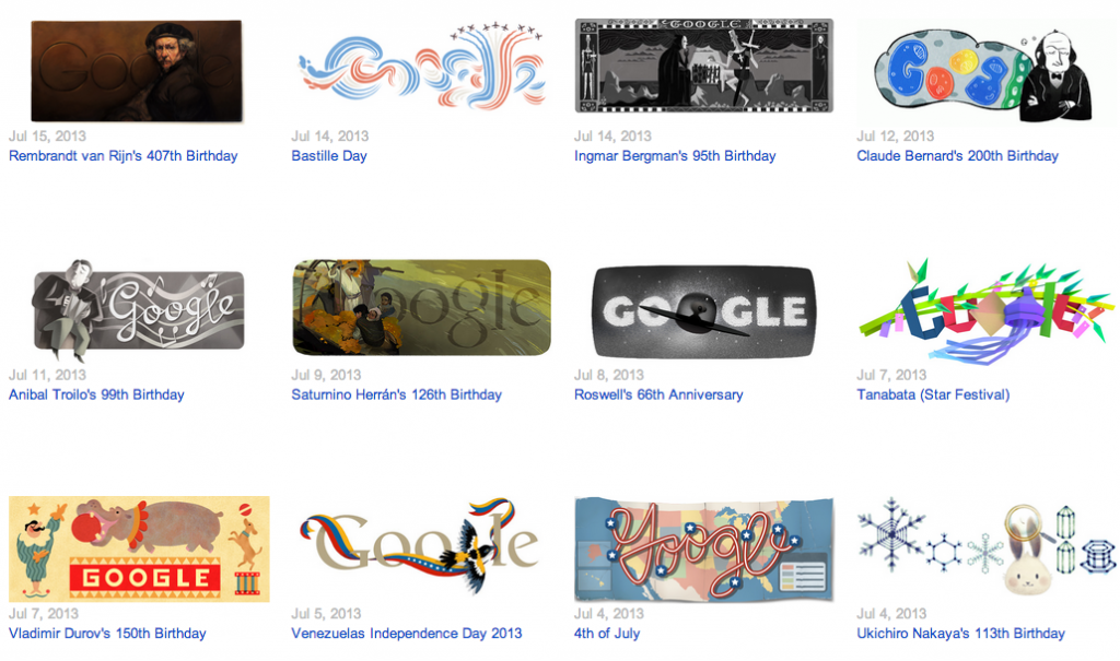
Elliot: That’s a good question. I have to think about it. What I can say is that I really appreciate great branding, branding that inspires me: Nike, definitely. Apple, of course. And Google. Google’s design says: “great functionality that’s human, young, fresh, fun, silly and nerdy (in a good way).” When you open Gmail, the interface is not particularly pretty, in fact it’s a bit clunky looking compared to Apple’s email interface, but that’s part of what makes it work so well as part of their brand—it’s ALL about functionality first—getting and organizing your mail in an accessible way. Then there’s the wacky stuff they do with their logo on special days– brilliant technology but fun, silly, and very human.
A little advice for newbies
Brigitte: What would you tell a protégé or someone starting out in design about how to develop their skills to be successful brand creators or brand managers?
Elliot: Find someone whose work you really like and work for them. There’s no better way to learn. Get around them on a daily basis and see how they think. Learn their process. Develop a relationship with them. If it works out, it’s something that you will treasure for your entire life.
Brigitte: Biggest reward in branding and design?
Elliot: There is no better feeling than to see something I created and designed in print or on the web, to see it viewed in public (if it hasn’t been mucked with, as we talked about earlier). To be handed a book I illustrated and page through it…delightful.
Brigitte: And, I have to end with a Cosmo question. If you could be any brand, which brand would you be and why?
Elliot: The Public Theatre: funky, modern and accessible—and I love live performance.
Nothing will ever take the place of sitting in a room filled with other human beings watching other real, live human beings trying to communicate something profound about the world we all live in.

