Choosing Stock Photos: The Good, the Bad, and the Cheesy (Updated 2019)
Welcome to a more visual world when choosing stock photos
With the online world getting more and more visual, everyone needs great images for their website, social sites, presentations and blog. It is worth noting that the open rate on posts with images is much higher than with text alone.
The optimal solution is to hire a photographer to take custom images, but if you can’t, stock photos are a necessity. Images draw people in, break up long blocks of text and add visual stimulus to what could be a sleep-inducing essay.
How to begin finding great stock images
Before you even THINK about looking on a stock site with millions of images, you need to have a concept. For instance, service professionals like attorneys and tech companies often use cityscapes in their headers. That’s because they have no idea who they are!
Positioning must come first! Determining your brand strategy will direct you to the right pictures. If you decide the key benefit of your product is that it makes data go faster, then choose images that give you a feeling of speed. If your service relieves stress, use a little emotion.
Learn more about Rebranding here
Look at the difference here:


Which one makes you experience stress? Which one are you able to relate to?
So where do you choose stock photos?
Google image search? Facebook? Sure! If you want to get sued.
Just because it’s on a Google image search, it doesn’t mean it’s not copyrighted.
The worst thing you can do is steal a photographer’s work for your webpage. Just Googling a picture and using it for own webpage is an infringement of copyright. Stock photo sites have millions of photos you can legally obtain for your webpages by paying per photo or a monthly subscription fee.
But stock photo sites do have one drawback:
They’re…stock photo sites.

If you’ve ever seen an image like this, you know you’re looking at a stock photo. Maybe the models pretend to make spreadsheets or sit around a conference table with a whiteboard that reads “Board Meeting”, or otherwise are obviously posed.
One of the worst offenders is the cliche image of hand-shaking. Although a good idea to show a connection, this one has it all: hand-shaking AND a cityscape. Plus, it’s blue.

And, my personal pet peeve: Word Clouds!
The words say innovation, modern, invention, but does this image convey that?

These photos are downright cheesy.
Choosing stock photos that have the style and look that expresses your original brand requires time, patience and the help of a designer. They can go beyond the obvious and create an emotional experience people connect with and remember.
This one is better, though it could even go a step further. I like it because the feeeeelings I have about AI get activated.

Here’s the good news!
Stock sites can be a great resource for finding images for your projects. On Shutterstock alone, there are over 250,000,000 images! BUT you need to know how to separate the good from the bad and the cheesy, and what to do with an ordinary image to make it stand out.
We often take a straightforward stock photo and manipulate it.
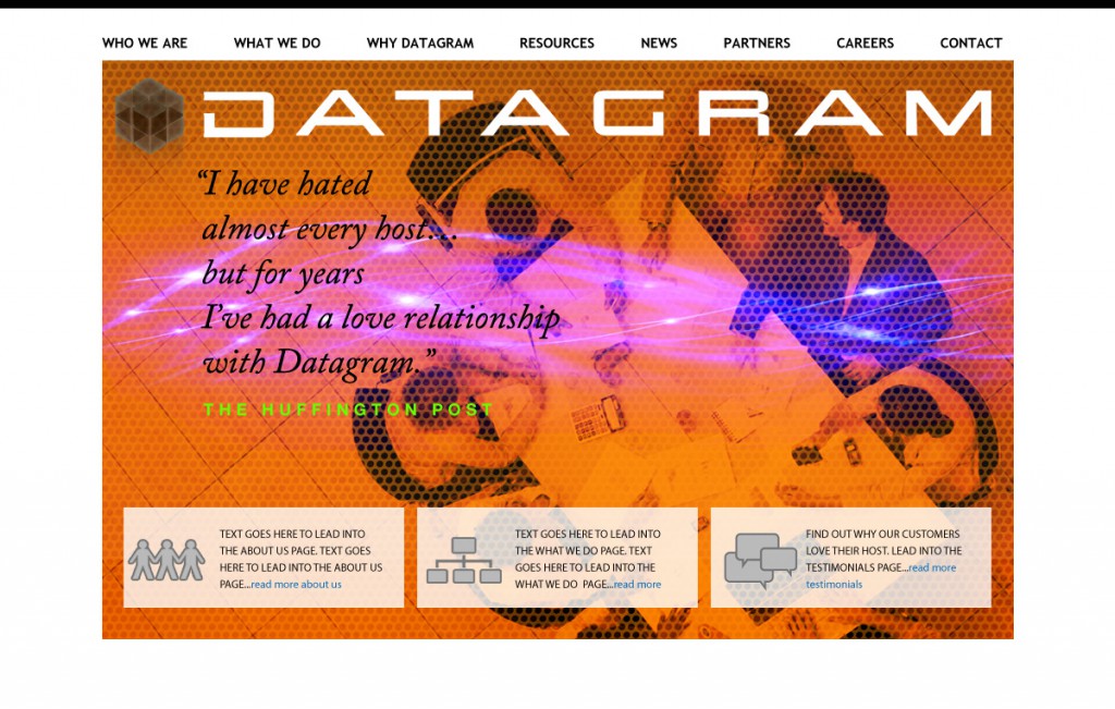
Even a typical image of a handshake or people around a conference table can become interesting through the magic of photoshop and a good concept. See the example below for an idea.
This is what we look for when we choose stock photos.
Sometimes we go through 1000 images to get one great one. But it’s worth it.
- Be patient, it takes time to search through it all.
- Look for images that make you feel something—laugh, become curious, or in some way connect with the image. if you don’t connect, neither will your readers.
- Try different search words. Go for the less obvious, sometimes it leads to more ideas. Search for details, such as for a health site, look for things that represent the RESULTS of good health, not just healthy-looking people. Things like a jump rope, a bicycle, just legs walking or feeling energetic.
- Check various stock sites, they often have different images for the same subject.
- Try cropping them in an interesting way—blow them up, cut off some of it, zoom in on a detail.
- Combine them with a texture overlay, alter them with an effect, or colorize them. Even an ordinary image can become something special.


Stock sites we like and use:
- Getty – For clients with budgets, this site has wonderful, unique images
- Shutterstock – Huge variety of images and vectors, subscription-based
- iStock – Pay-per-pic, lots of choices
- Jupiter – Pay-per-pic, great variety
- Blend – For diversity, this site can’t be beat
- Creative Commons: For news-related images. Check the copyright.
Be creative, experiment and create awesome images!


