Design on a Diet: Why Minimalist Design Works
Why minimalist design works in communicating an idea
Minimalism works in fashion, electronics and on websites too. It means stripping down a design to what is essential, leaving out decoration. That may mean different things to different people, but to us, it means “keep it simple, stupid.”
Chief Network9-er Carmen Yazejian says:
“When it comes to your company’s visual voice, trim the fat. Show the best and forget the rest.”
Our clients often say they want “something simple”, but they mean “Cheap”. Making things simpler is actually more work. We have to determine what is a priority and what a visitor needs to be there to get what the want.
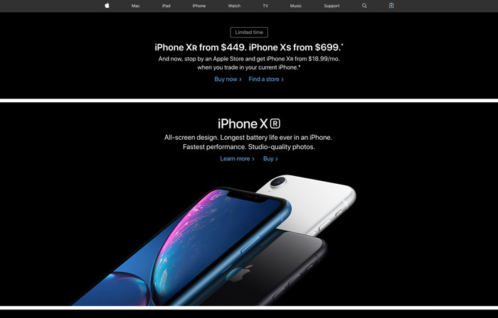
Apple is always seeking minimalism, because it focuses the user on one gorgeous product at a time, with exactly the right amount of information they need to take the next step in purchasing.
All that being said, our own website designs are getting cleaner all the time, it’s just more modern looking and easier on the eye. Cramming more onto a home page doesn’t work the way people think— too much clutter makes people shut down and lose focus.”
Simplicity is the Ultimate Form of Sophistication

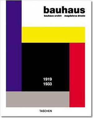
Japanese floral designers know it, Bauhaus designers knew it, Frank Lloyd Wright practiced it, and Steve Jobs knew it too.
Apple’s visual voice followed his passion for simple user experience, and form followed this function. From its products to its stores to its ads, minimalism was king, down to removing the last screw. He was the master of minimalist design because he took away what wasn’t needed. That made the usability of his products the focus.

When Steve Jobs died, the perfect tribute was a loving, simple fan design that went viral in hours.
As Jobs himself would say, “It’s insanely great.”
Apple’s not the only company to see the power of simplicity.
In a world of clutter, minimalism is a way to cut through the noise. And don’t ad makers know it.
As Albert Einstein said, “If you can’t explain it to a 6-year-old, you don’t understand it yourself.”
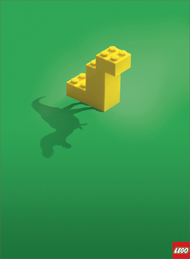
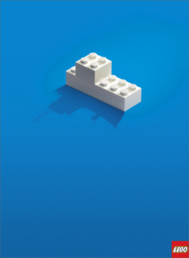
Minimalism’s haters say that less is less. But look how much Lego did with so little. Anyone who has constructed a lego project knows their instructions don’t even have words, just like these ads, yet we get it in an instant. From Bauhaus to Helvetica to haikus, simplicity works across all mediums.
Famously, Ernest Hemingway was once asked to write a story in six words.
His response? “For sale: baby shoes, never worn.”
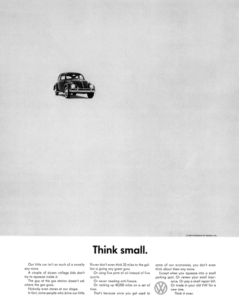
Great art makes every word or image count. This super-famous Volkswagen ad turned Madison Avenue upside down in the 60’s with this minimalist design, and made this new, very small car, into a symbol of cool. The white space emphasized the small size of the car, turning what could have been a lemon into lemonade. The rest is history.
Have ideas on why a minimalist design works? Tweet at us @network9. After all, 140 characters is the perfect chance to practice some minimalism of your own.


