Designing Obama: Could A Font Have Won An Election?
The Power of Brand Design on the Election
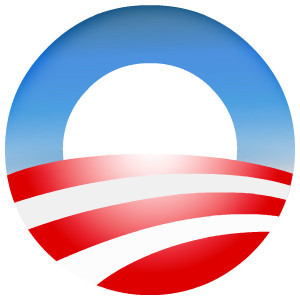 We’re feeling good this week. We feel good about the direction of the country. We feel good about the vision of the President. And we feel great about the powerful impact that design has had on this election. We wondered…Could a font have won the election?
What Steve Jobs brought to Apple — a passion for design that changed computers forever — Team Obama brought to political marketing. Design was no longer just for bumper stickers and yard signs to be quickly discarded once campaign season ended. Design was about identity. It was about starting a movement. It was about creating a brand that is as singular as the President himself.
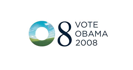
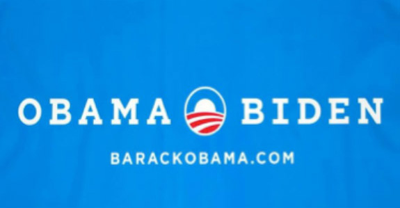
The Obama logo — a blue “O” rising over a striped field of red and white, evoking an American sunrise — was the candidate’s own Nike swoosh. Without using a single word, the logo became a symbol for a new day in politics. The O logo helped a Senator from Illinois achieve the seamless brand identity that most global businesses strive for. Today, it can be found everywhere from bakeries to the annual pumpkin contest, Yes We Carve.
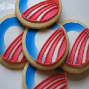

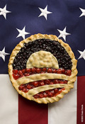
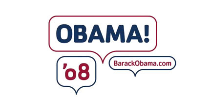
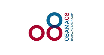
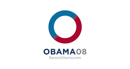
The logo’s creator, Sol Sender, recently released some versions from their brainstorms that didn’t ever see the light of day.
Many of these are wonderful. They each have a distinct idea and character. Tough choice! but in the end, the circle logo became iconic and there were many riffs done on with it by the always creative public. Food seemed to lend itself nicely to the circular design. Watch the video interview with Mr. Sender
Obama Uses Gotham: Modern, Clean, Bold Font
The cornerstone of President Obama’s visual identity was the font Gotham. Campaigns usually use a hodgepodge of typefaces, which are often at the whim of whoever presses “Print” at Kinko’s. Not so here. The Obama campaign insisted on uniformity and design discipline. Gotham worked not just because it looked good, but because it was applied with the consistency of a brand. It stuck — Gotham became instantly recognizable as the Obama font.
Says Michael Bierut is “Gotham is a sleek, purposefully not fancy, very straightforward, plainspoken font, but done with a great deal of elegance and taste–and drawn from very American sources”
Hillary’s Old School Font: New Baskerville
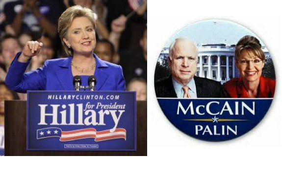
For those who think fonts don’t matter, ask Hillary Clinton, whose stiff and predictable design scheme confirmed voters’ wariness that she was simply a product of the establishment.
She later admitted her font, New Baskerville, had the “look of someone who pulls their pants up too high.”
Or John McCain, who chose Optima, a font from the 1950s used on the Vietnam Memorial in Washington D.C. The font was chosen to evoke associations with McCain’s military service, but it proved to be a a ho-hum design that was quickly forgotten.
Read more about how Trump outbranded Hillary in the 2016 election
Sensing that he needed a change to re-energize his brand, Obama updated his look for the 2012 campaign. The designers of Gotham tweeted this in April: “Gotham with serifs? OK, but only because you asked, & you’re the President of The United States.” Works for us!
Romney: Waffling on His Brand
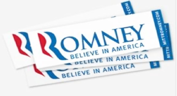
For his official campaign font, Romney commissioned the same design house, Hoefler and Frere-Jones, that designed Gotham for the President. They created a new version of Trajan Bold and a pleasant, if not revolutionary design. Trajan, Hoefler told The Wall Street Journal, expresses the “conservative promise” of Mitt Romney’s campaign and is “pleasing, without being too edgy.” The design reflected the man: traditional, conservative, and a candidate with old school sensibilities. Instead of sticking with Trajan the way Obama stuck with Gotham, the Romney campaign also employed Kepler, Whitney and Mercury, which may have undermined brand recognition.
Governor Romney’s campaign also tried their hand at a logo. Romney’s triple Rs were meant to show patriotism, and could have worked well with better execution. Instead, it ended up looking more like a dollop of toothpaste.
Romney did not have a comprehensive design strategy, and in the end he fell short as both a candidate and a brand.
President Obama probably won the election with his charm and vision, but the font didn’t hurt! We think he won the design race too. By using smart and consistent design, Obama became America’s first candidate to market himself like a high-end consumer brand. Like the President himself, the design strategy leaned forward.
