Print is NOT dead.
Even with web dominance, print material still plays an important role in sales and marketing. The tactile feel of a physical paper piece cannot be duplicated in pixels. A professional brochure design can remain on a customer’s desk for months, make an indelible impression and keep you top of mind.
Our approach to brochure design
- We look at the product itself to inspire the design.
- If it has a distinctive shape, recognizable design or color, we love to capture that in print.
- The headline is key to grabbing attention. We like them bold and purposeful.
- We keep the copy simple and as lean as we can without losing vital information.
- The copy must show the value of the product/service and have a clear call to action.
- A little fun doesn’t hurt either.
Have you ever picked up a brochure at a trade show just to be polite and tossed it in the recycling bin right after the show? I have. Most of them are boring because they are filled with long lists of services, bad photography and don’t give me a reason to buy. We change that.
Imagine your clients keep your brochure on their desk for weeks or post it on their bulletin board. That keeps you top of mind and when people are ready, your brochure brings you business.
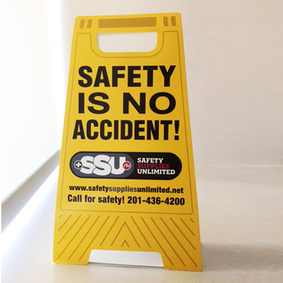
The safety stand up-sign has been seen in lunchrooms and on many desks to remind people to pay attention to safety.
What do you want people to remember about your company?
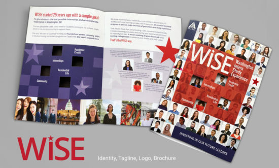 WISE-Identity-and-Brochure-design
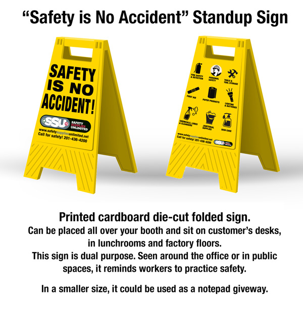 SSU SAFETY SIGN FOLDOUT brochure
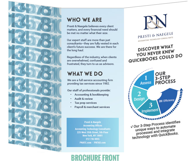 Presti-Trifold-brochure-design-Front
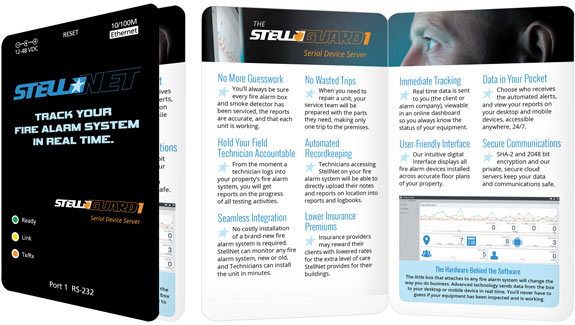 The brochure design mimics their actual product— the little box that attaches to the fire alarm box and transmits the data.
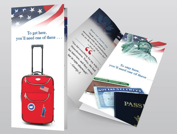 trifold brochure design for TNT, an immigration law firm
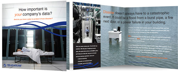 Telehouse Disaster Recovery Brochure
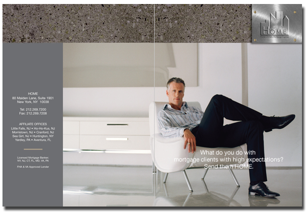 NJ Lenders brochure design
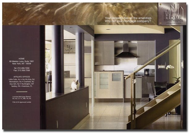 Second brochure design for a NJ real estate company.
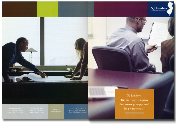 Front and back cover for a real Estate Lender's commercial division brochure.
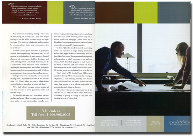 Inside spread for a real estate commercial lender's brochure.
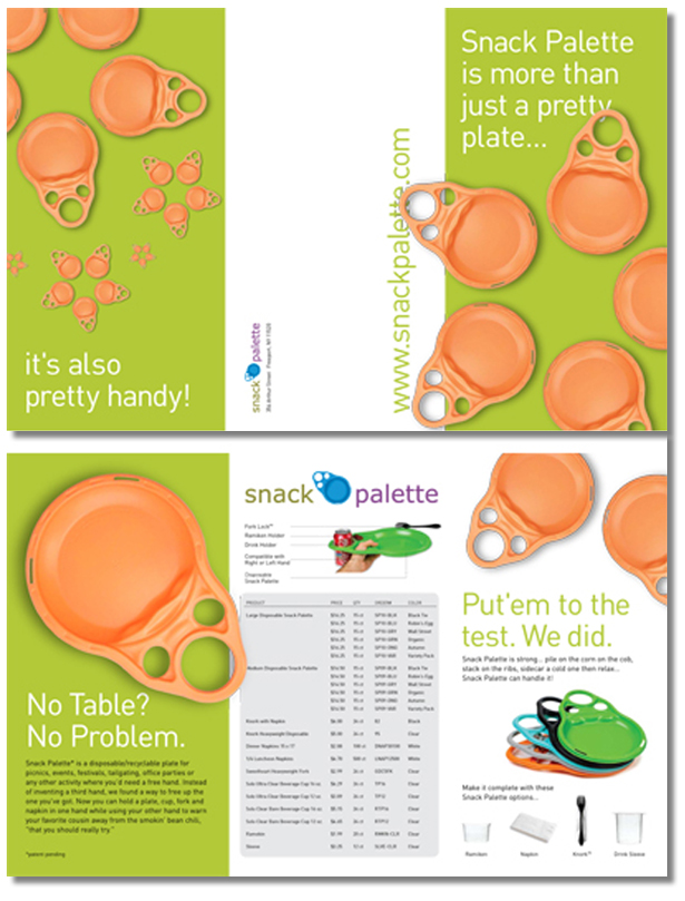 Tri-Fold brochure for Snack Palette, the revolutionary new way to dine with one hand.
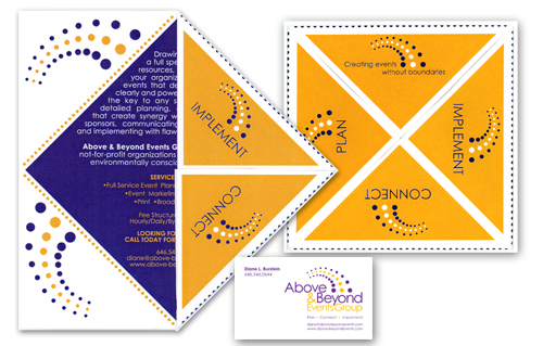 Brochure design for Above and Beyond event planners. It gets mailed as a square and the flaps open up to reveal the information.

