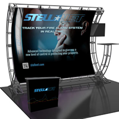
Trade show banner design presents unique challenges.
With hundreds of booths lining the aisles and visual fatigue by attendees, trade show banners have special design challenges. They need to simple, clear and viewable from 20 feet away. Many banners are cluttered with bullet points, not unlike PowerPoint presentations! Bold graphics and oversized type grab attention in crowded aisles.
You banner should be a backdrop in your booth, not a distraction. If they have to read a lot of text, you will compete for attention.
Keep the important stuff on top.
The important elements need to be on the top half of the banner. Information below waist height should not be crucial, merely decorative, as it is sometimes hidden by people and furniture.
Be visible 20 feet away
When someone is walking down an aisle at a crowded, busy trade show, it pays to have an eye-popping banner design that’s visible 20 feet away.
At Network9, we take the big bold approach to attract customers to the booth. And it’s been working for our clients. Here are a few of the banners we’ve designed that have pulled visitors into our clients booths.
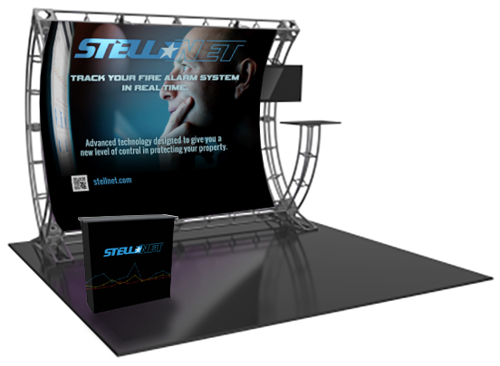 Banner and Podium design for Stellnet's trade shows.
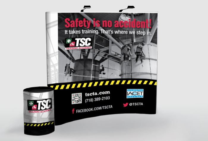 Trade-Show-Display-Design
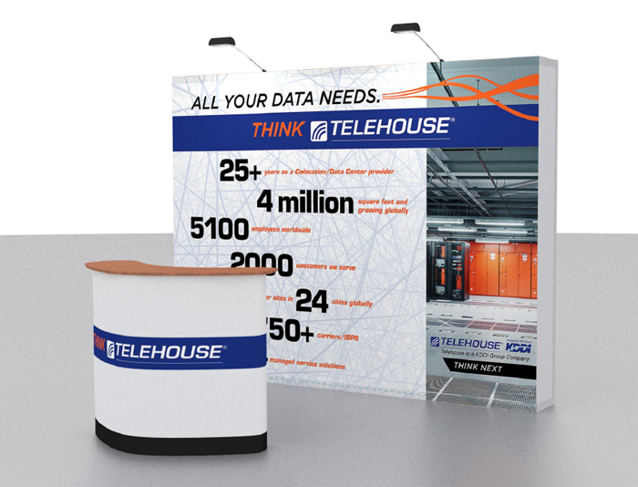
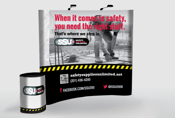 SSU-Trade-Show-Display-design
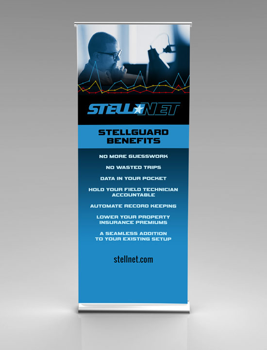
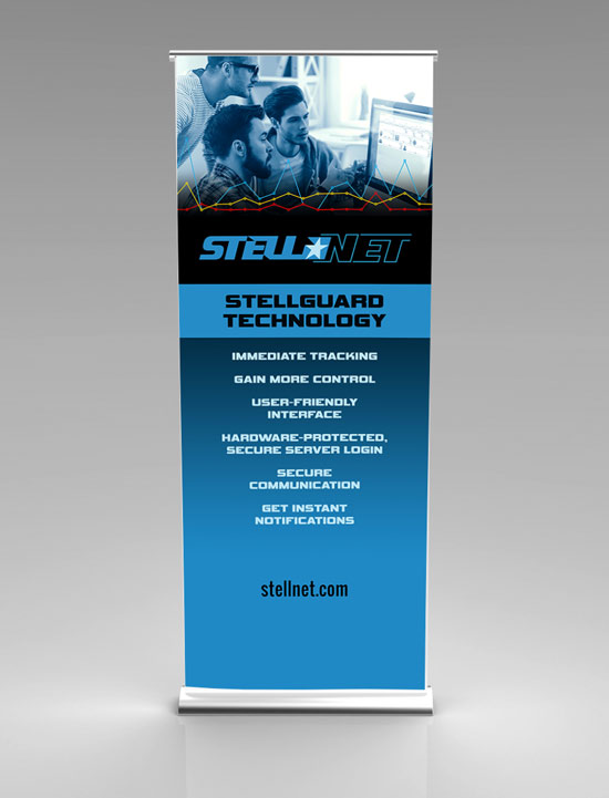 Tall trade show banner design for Stellnet's shows.
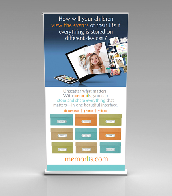 Memoriis-Trade-Show-Banner Design
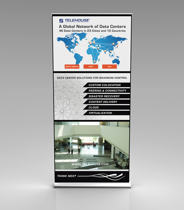 Telehouse-trade-Show-banner-1
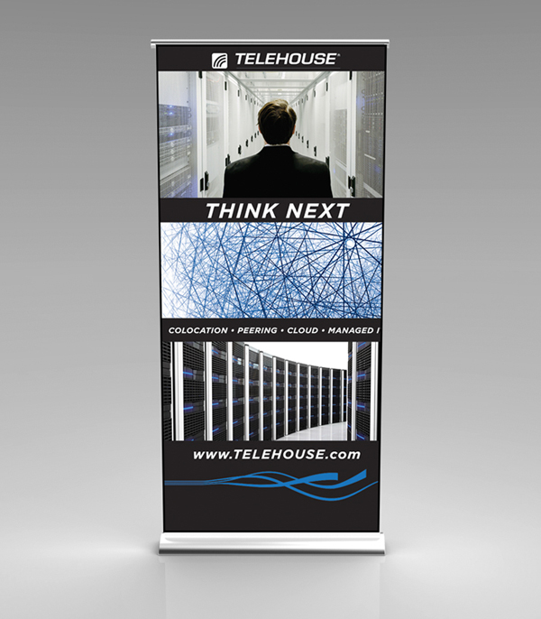 Telehouse-Trade-Show-Banner-2
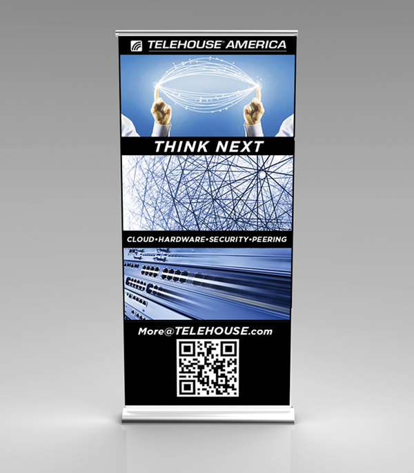 Telehouse-Trade-Show-Banner-3
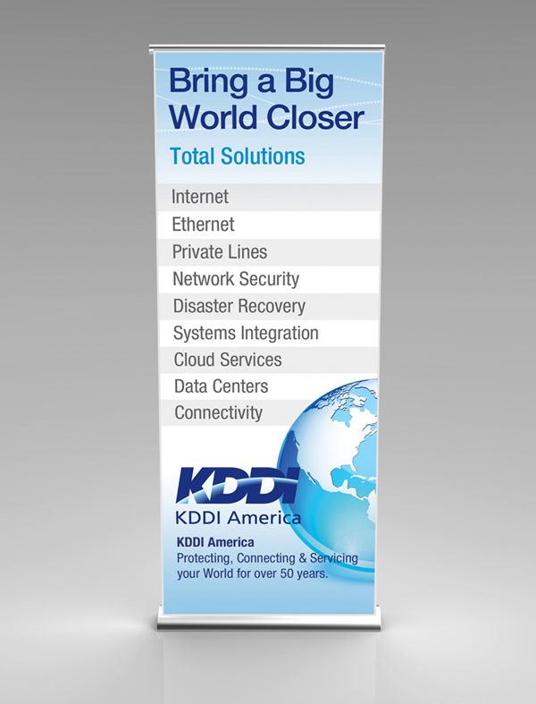 KDDI-Trade-Show-Banner Design
 Path-Trade-Show-Banner Design
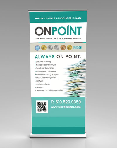 trade-show-banner-design-onpoint

