Textbook Perfect H Tag Structure
 Have you ever been on a website where the information seemed random and made no sense?
You probably left the site feeling frustrated because you couldn’t find what you needed and were more than a little confused about what the company actually did. Don’t worry, you’re not the only one feeling confused. Google is probably confused too. H Tag structure makes it easy for searchers and (search engines) to prioritize content.
Just like the contents of a textbook, your website’s pages should be organized in a coherent, meaningful way. These headers take your visitor on a logical journey through your content and helps them “connect the dots” about what your company does.
Book Editors call this a “Through-line”. In the branding world, we call it a Brand Identity.
A quote from an article by Amy Benson Brown says it well:
“…a great though-line makes it easy to see how all the pieces of evidence come together to illuminate the book’s central claim.”
Swap out “book’s central claim” for “company brand” and you have:
“…a great though-line makes it easy to see how all the pieces of evidence come together to illuminate the company brand.”
That’s exactly what a well-structured website should do. Present the “evidence” to paint the picture of your brand.
Unlike a textbook, people jump around on websites (well some people like to jump ahead and ruin the ending of a good book!). Reading online is very different from reading a magazine or a book. People scan content to read what interests them. Rarely do they read through in the order you wrote it. If you have a user-friendly website, these people will be more likely to come back, especially if your information is well organized.
So how do you structure a user-friendly webpage to keep people coming back for more?
Here, we’ll show you how to do just that, and show you how to use HTags to help Google see it too.
How to Structure Your Website Navigation
Think of your main web pages as chapters. These are the sections that live at the top of your navigation bar. In your drop-down menu are the sections of that chapter. If the chapter is “Services”, list your services in the drop-down under that tab. If the chapter is “About Us”, include all your company information under that tab.
You should write your site this way from the beginning. Start by making a site map. Then you can see how each page relates to the others and see how the information flows. Only then should you write the copy.
How to Structure Your Pages with H Tags
To take this a step further, your individual pages should also have a clearly defined structure that takes your reader through your information in a logical sequence.
This is pretty much how Google reads a site. It also this impacts your sites SEO and is where H Tags come in. Read more about SEO
H Tags help search engines “read” your content and understand what your page is about. Clearly structuring your headers and subheaders also makes it easier for your readers to digest your content and find what they want.
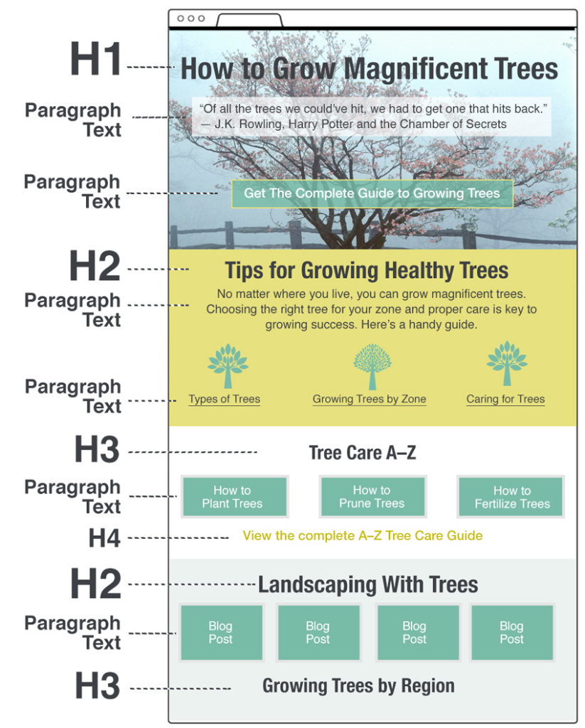
Take a look at the illustration below. It sets out what a well-structured web page looks like.

How H Tags Are Set Up In The Code
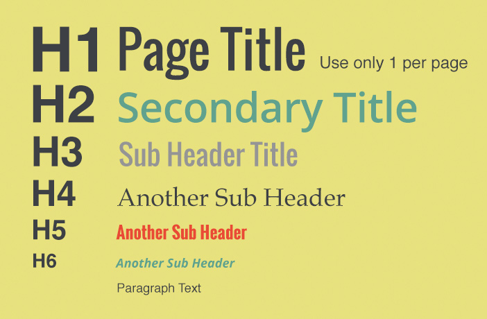
H Tags stand for Heading Tags. The style should be determined during the design of your website, and typically the fonts vary from largest (H1) to smallest (H6).
Your programmer will set up your tagging structure in the code from the start. When you build pages or write blogs, you’ll be able to select the H Tags you need from your text editor menu. I often see people using H tags when they want a larger font style, which is a very bad idea. If you need a variety of sizes, ask your developer to include a way to do this, but don’t use your H Tags to accomplish a visual task.
H1 tags are special.
They are typically the title your reader see when they visit a page. There can be one and only one per page, AND, only one page on your entire site with that unique H1 tag. Usually, the H1 Tags are set (by default) to be the page title. H1 Tags are not the same thing as your page title.

Your page title is the text you see when you hover over your websites tab in the web browser. The page title is the second most important thing on your page (after content) in relation to SEO. It tells Google what your page is about and it is the link text that appears in Google search results. Your page title can and should be a more accurate description of what’s on your page than the H1 Tag. You should use your H1 Tag to grab attention, the page title can tell Google what your post is about.
Think of H1 Tags As Your Chapter Titles
On each web page, there should be one main idea (H1), different sections of information (H2), and subsections of this information (H3-H6). Body text fills in the chapter information. This structure creates a logical flow of information that helps the reader find what they are looking for, come to a conclusion or take an action at the end of the page.
Use Only One H1 Tag Per Page
Have you ever seen 2 main titles in one chapter of a textbook? Of course not, this would be too confusing. The author just writes another chapter. The same principle applies to your website’s pages. You should use only one H1 tag per page. This lets your readers and Google know what this page is about.

H2, H3 and H4 Tags
You can use many H2 and H3 Tags on your page. These define the main sections within the H1 ‘chapter’ and should follow a hierarchy of importance. These tags present prime opportunities for you to use keywords that reflect the subject matter of that page. H4-H6 Tags can also define other key information.
Key Takeaways
- Remember, your H1 Tags are special.
- There should be one H1 per post.
- If you use more than one H1 Tag and Google is going to punish you.
- Your H2 Tags will set out and guide your reader through the different sections of your pages.
- Finally, the different subsections of the sections of your should be set out using your H3-H6 Tags. H 4—6 tags are infrequently used, but sometimes necessary.
- One last tip. Do NOT stuff your H Tags with keywords.
- ‘Stuffing’ your headers with keywords is not user-friendly and Google hates it. If you do this, Google will penalize you. Who wants that?


