Marketing for Theater: Websites That Get a Standing Ovation
Marketing for Theater
Network9 is back with more tips for theater companies who want to make their digital footprint known. In “Be a Smash Hit Online”, we wrote about Social Media and how theaters are leaving money on the table by not taking advantage of Twitter, Facebook and YouTube.
In this installment, we’re tackling what is, arguably, a theater company’s “opening act”: their website.
First things first. When marketing for theater, if you don’t have a website, stop reading this and get to work. (On second thought, keep reading to get some ideas to make yours stand out!)
In the digital age, when people hear about your theater, the first thing they are going to do is Google you.
When they click on your website, their experience with your theater begins. Make it as good as your productions.
A professional looking, visually compelling website is a must, of course, but here are some elements you might overlook that could mean the difference between someone taking a pass or becoming a patron.
1. Show your theater’s unique personality

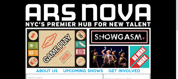
You have a unique theater company, so have a unique website. We love the front page for ArsNova. It immediately tells you what kind of work they produce. “NYC’S Premier Hub for New Talent” has a fun, youthful energy that lets you know this is a place where anything can happen. No matter what kind of work you produce, have your website’s personality reflect it – your audience will immediately know who you are and if they’d be interested in paying a visit.
2. Use photos, photos and more photos!

You’re a theater company—there is no excuse for not littering your website with photos of your productions. Marketing for theater can be a very visual experience given the nature of the business. Giving a sneak preview of what’s to come will make the visitor want to see more, and buy a ticket. Create visual interest with SUPER dynamic photography. You have amazing fresh, unique material to work with (production stills, etc), so use it! LOOK at the front photo on the Signature website. It’s a grabber!
3. Let people know WHY they should see your plays.

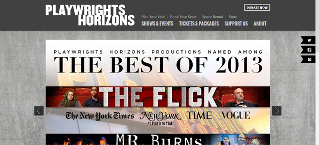
When you get amazing reviews from The New York Times, Time Out NY and awards from every magazine on the newsstands, tell people! People LOVE award-winning theater. Follow Playwright’s Horizon’s example and put your accolades right on the front page.
4. Make connecting EASY with social media icons and “share” overlays

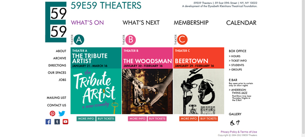
Remember our post on Social Media and theatre? 59E59 has got this on lockdown. They’ve got 5 visible social media icons and active accounts on each site.
Also, remember this age-old truth: people are much more likely to say “yes” to something if it’s directly offered to them.
“Would you like to make a donation today?” “Would you like to supersize that?” With that in mind, put a small, unobtrusive overlay on your page (make sure it doesn’t obscure your content) asking people to “like” you on social media or “share” your posts on their own pages. If you don’t ask, you don’t get!
5. Make ticket buying a no-brainer

Once people are sold on your show – they want to buy a ticket! If your ticket buying system is frustrating (bad links, unclear verbiage, a lagging shopping cart) your possible patron is going to get annoyed fast. Make sure that your ticket buying options are visible, clear, and accessible.
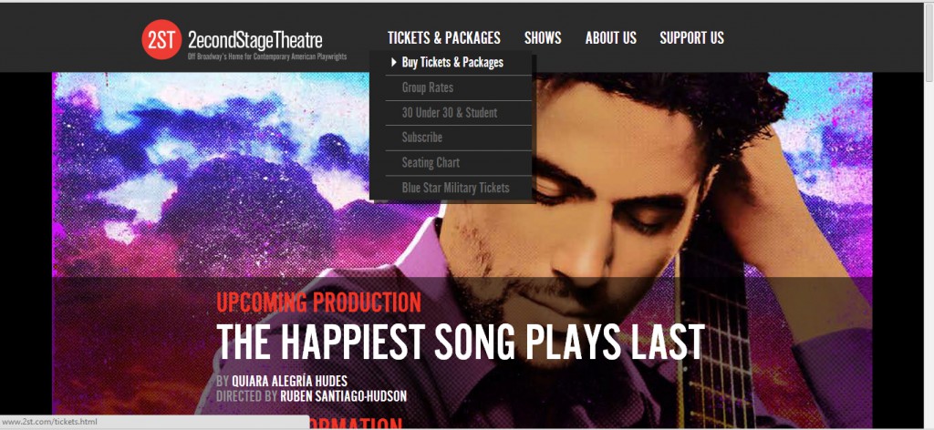
Look at how 2econdStageTheatre has “Tickets and Packages” as the first link on their page, and a clear drop down menu that gives you every way to buy tickets possible. Stress-free and streamlined, just the way your patrons like it.
In part three, we’ll go deeper into the innovative ways theatre artists can embrace and utilize technology, highlighting some of the most exciting examples of tech-saavy theatre to date. Stay tuned for the next act in Marketing for Theater.


