Hottest Web Design Trends…Circa 1996
Sweet web nostalgia
If you’ve been online for more than a decade, you’re sure to get waves of “website nostalgia” every time you come across a site that’s…well…a little creaky.
Web design trends move fast, and it’s easy to spot a “grandpa” site (meaning a site that’s maybe more than 3 years old). But there are some gems from the olden days of website design that still have a quirky if antiquated charm.
1.) Random Navigation and Repeating Background Images
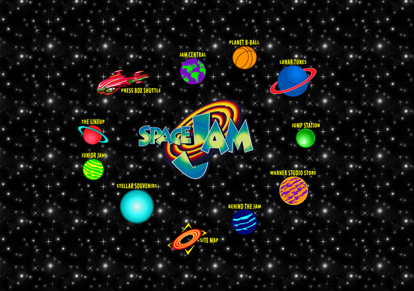
Does anyone remember that movie Space Jam? You know. Michael Jordan, Bugs Bunny. It was the best if you were eight in 1996. Well look at this. Yep. Space Jam’s website is still up and running, and still pretty cool.
There are a galaxy of vintage things about this adorable time capsule, but our personal favorite is that repeating star background. You can pretty much see the seams in the blanket of stars. Ah, the nineties. A more innocent time – a more neon time, when people had time to look through non-linear navigation design.
2.) Fuzzy Drop Shadows
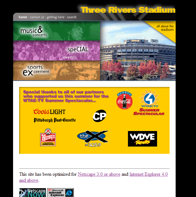
The Three Rivers Stadium was torn down years ago – but the website is still up and running. Check out charming fuzzy drop shadow on that title text. Cringe worthy, we know, but back then, Photoshop’s functionality and our design tastes were a little…eh. (Also, Netscape 3.0.—That’s from another era.) Luckily, this web design trend didn’t last.
3.) Electric Blue Links
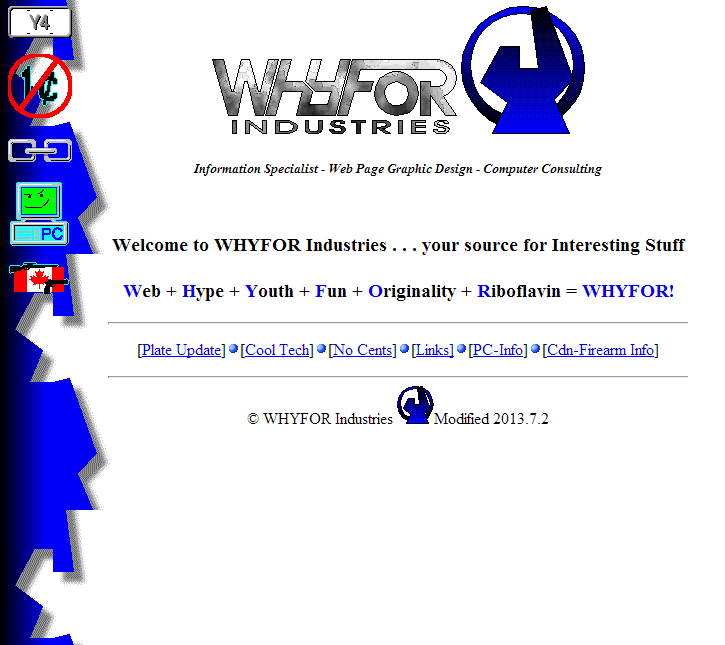
This baffles us. WHY was this electric blue so popular in early web design? It might have to do with what monitors could display back then because wow that is horrifying and cannot be anything but a forced decision. We think Google started the electric blue link color, and uses it to this day. Though we know the links are highly visible, we designers had to work hard to change the blue link convention to colors that are a little easier on the eye.
4.) Times New Roman
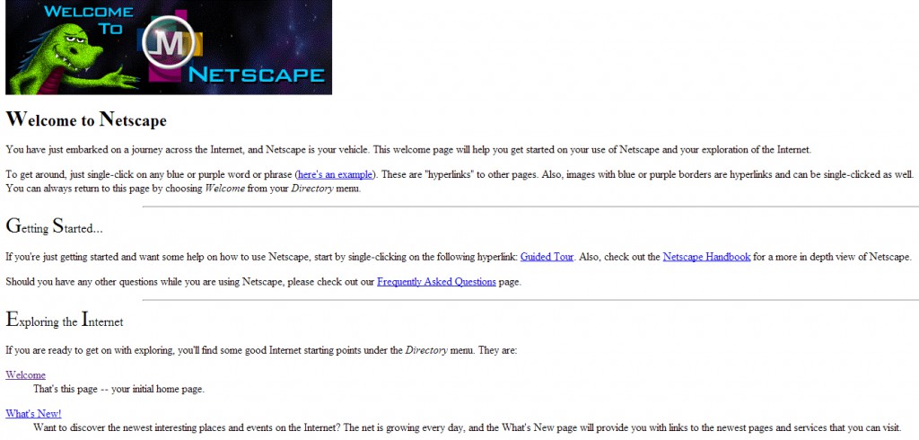
This is the home page for Netscape, circa 1994. Old websites didn’t have the functionality to use fonts other than Arial or Times New Roman until fairly recently. So what you end up with is…a LOT of Times New Roman. Though classic, this typeface is so still commonplace nowadays.
And look! Netscape used SuperCaps. Isn’t that charming?
5.) Embossed Titles
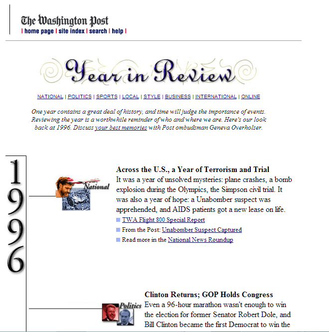
If there’s one web design trend that’s creakier than a drop shadow title, it’s an embossed title. This one is circa 1996. Can you believe this site belonged to the Washington Post? That embossed text makes it look like a Barbie box. But that’s the way we did it back then—we had to use images for any fancy text, and you can see what mayhem can happen!
6.) PIXELS!
We’re really not being mean. Back in the day, resolutions just weren’t what they are now. But holy Chrome, look at that pixilation. It’s stunning. That grainy effect is bringing up so many happy 1999 web memories, even if it’s simultaneously burning my 2014 eyes.
7. Flash Animation and alternating text and images
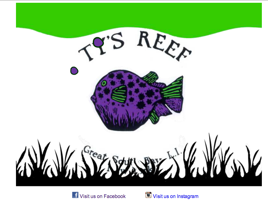
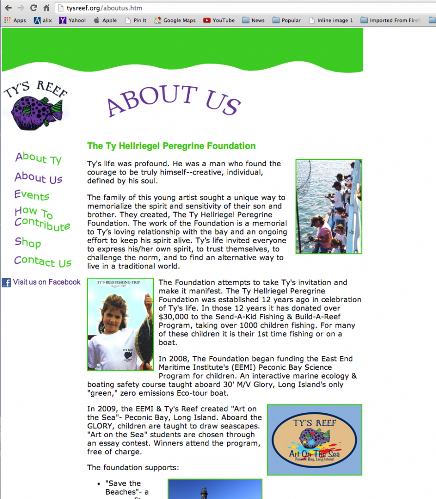
Who remembers flash home pages? We do. This is one of our own and very first websites. The way it’s stuck to the left side and uses alternating images in the text was state-of -the-art way back when, and pure turn of the century. But the site still works!
Back to the Future!
Who knows what trends web design’s going through now will seem “creaky” in a few years. “Does this website still have a 2014 responsive layout? Wow. How’s that supposed to fit on my GoogleBrainMovies app?”
Send us your favorite vintage websites.

